One of the fun things you can do when you run your GNU/Linux in virtual machines is to copy their directories to make new VMs and experiment without having to do a complete install or risk your source VM. And they’ll also already be configured to your preferences with desired applications (just change your Syncthing keys). So I copied my Debian 12 VM twice, converting one to Debian Testing and the other to Debian Unstable. Debian Unstable is basically all the new packages being worked on for the next release of Debian, with Testing being those packages vetted a bit. It’s referred to as Unstable because there could be some breakage with dependencies or bugs, but there are ways to alleviate the risk. And some GNU/Linux distributions are actually based on Debian Unstable and Testing which people run as a rolling release of Debian along the lines of Arch, though Arch has the newest packages as my laptop has been on KDE 6 for quite a while (with all the bugs), and Debian Unstable is still KDE 5.27.11.
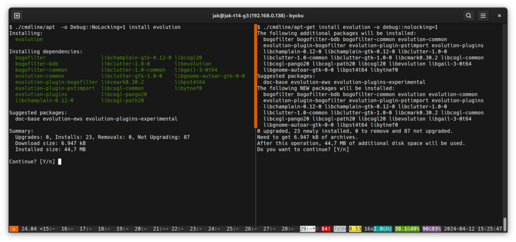
Running Debian Sid I noticed that my Nala front end for Apt wasn’t installing all the updates which I suspect was because Debian Sid has moved to Apt 2.99 (currently a beta to be Apt 3.0 on release of the stable version). So I started using the new Apt. And the addition of the formatting changes and color is really nice along with a new progress bar at the bottom. It’s not as visually pleasing as Nala, but it is a big improvement to look forward to in the next version of Debian. And you could make the argument that you don’t need Nala except maybe on your desktop machines.

https://www.phoronix.com/news/Debian-APT-2.9-Released
APT 2.9 Released: Debian’s APT 3.0 To Have A New UI With Colors, Columnar Display & More
By Michael Larabel
APT as the packaging tool built around Debian Linux is embarking on some big upgrades with the APT 2.9 development series to then roll-out as APT 3.0. There’s big improvements to the command-line user interface with the new APT and it’s certainly looking nice from my initial Friday night encounter.
Released tonight was APT 2.9 as the latest version to this packaging tool used on Debian and derivatives like Ubuntu. Catching me by surprise in the release announcement was:
“Welcome to the APT 3.0 development series. It has a new UI for apt(8). It has colors, columnar display, some more padding, and shows removals last (Closes: #755088), making the output more easy to quickly scan.”
Catching my interest, I decided to quickly try a test build of APT 2.9 on an Ubuntu box.
Ooo yes APT is finally sporting colored text.
I immediately loved the columnar format for the APT output. Paired with the colors and columnar format, the new text UI is a big improvement over the long-standing APT output.
While just spending a few minutes with the new APT 2.9 build, it’s a big improvement in my perspective over how APT has long looked with its text user interface. This will culminate with the APT 3.0 stable release but already the coloring and columnar layout is a big improvement for quickly sorting through the output when involving a long list of packages.
It’s looking nice and I’m looking forward to APT 3.0. Downloads and more details on today’s APT 2.9 release to Debian unstable via the v2.9 announcement.