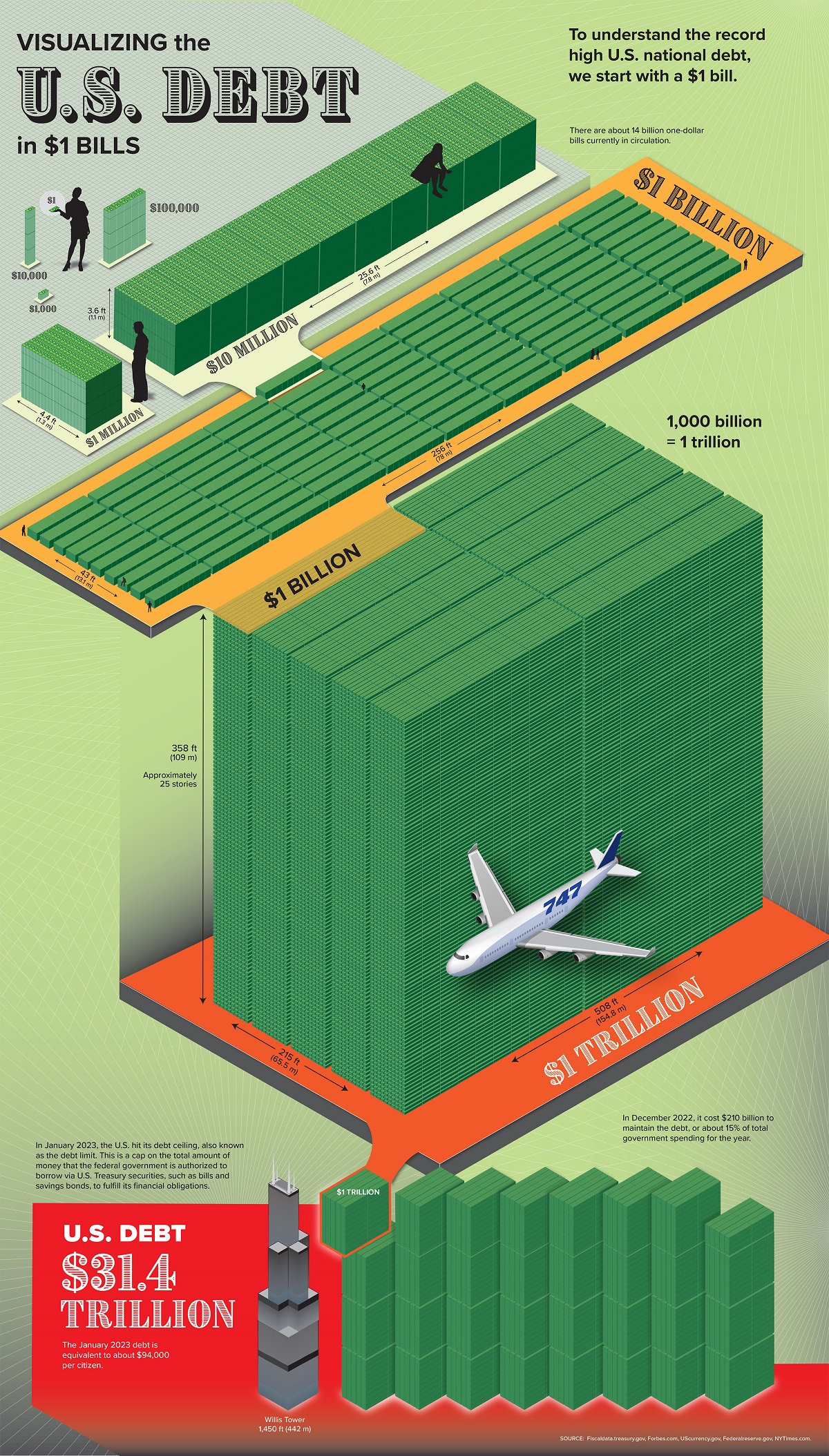
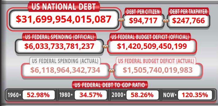
This is a great graphic to put things into perspective. I used to work for Brinks Armored back in the 90’s, and pulled into the currency room we’d have millions in 20’s stacked on a table to get bagged up for ATM machines, and it would be a surprisingly large volume. I’d be curious to see the same graphic in 20’s or 100’s. And you have to remember that we have to service all this debt with a significant portion of tax income going to paying interest on all these bonds. The second graph has the debt per citizen and debt per taxpayer, and that should should really scare you. The site that’s from is worth exploring and linked below.

